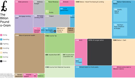
First up, David McCandless’ Billion Pound-O-Gram which very neatly allows us to compare how big various large sums of money are in relationship to each other:
Then there’s this Periodic Table of Visualization Methods. Mouseover each ‘element’ for an illustration of the method.
And finally, Pedro Cruz’s visualisation of the decline of the world’s four major maritime empires, which is just glorious. (Full-size version on Vimeo.)
Lovely, eh!
